


The <input> Element
The most important element in a form is <input>. This element can change its characteristics thanks to the attribute type. This attribute determines what kind of input is expected from users.
The types available were a multipurpose text and just a few more specific, such as password or submit. HTML5 has expanded the number of options available thus increasing the possibilities for this element.
In HTML5 these new types are not only specifying what kind of input is expected, but also telling the browser what to do with the information received. The browser will process the input data according to the value of the type attribute and validate the entry or not.
Email Type
Almost every form in the world has an input field to insert an email address. But so far, the only type available for this kind of data was text. The type text represents a general text, not specific data, so we had to control the input with Javascript code to know for sure that the text inserted was a valid email address. Now the browser is taking care of that thanks to the new email type:
Example:
<!DOCTYPE html>
<html lang="en">
<head>
<title>Forms</title>
</head>
<body>
<section id="form">
<form name="myform" id="myform" method="get">
<input type="email" name="myemail" id="myemail">
<input type="submit" value="Send">
</form>
</section>
</body>
</html>
This is the result of our code;
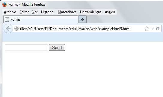
The text inserted in the field generated by the code will be checked by the browser and validated as an email. If the validation fails, the form won't be sent.
How every browser will respond to an invalid input is not determined by the HTML5 specification.
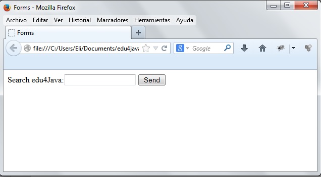
Search Type
The search type doesn't control the entry; it's just an indication for browsers. Some browsers will change the design of this element by default to provide a hint to the user about the purpose of the field.
Example:
<!DOCTYPE html>
<html lang="en">
<head>
<title>Forms</title>
</head>
<body>
<section id="form">
<form name="myform" id="myform" method="get">
Search edu4Java:<input type="search" name="mysearch" id="mysearch">
<input type="submit" value="Send">
</form>
</section>
</body>
</html>
What we get is a field which behaves like a regular text field;
URL Type
This type works exactly like email, but for web addresses. It's destined to receive only absolute URLs and return an error if the value is invalid.
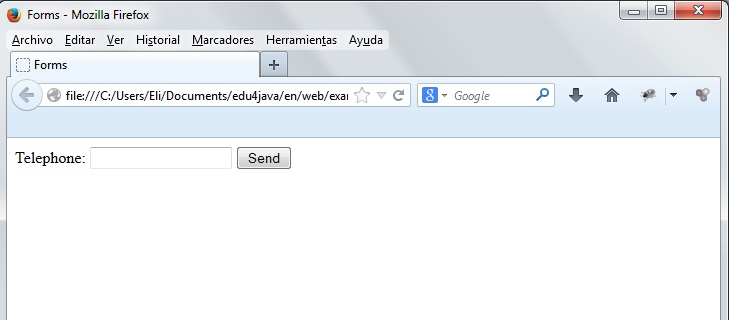
Tel Type
This type is for telephone numbers. Unlike the email and url types, the tel type doesn't force any particular syntax. It's an indication for the browser in case the application needs to make adjustments according to the device in which it's being executed.
Example:
<!DOCTYPE html>
<html lang="en">
<head>
<title>Forms</title>
</head>
<body>
<section id="form">
<form name="myform" id="myform" method="get">
Telephone: <input type="tel" name="myphone" id="myphone">
<input type="submit" value="Send">
</form>
</section>
</body>
</html>
This is the result:
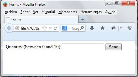
Number Type
As indicated by its name, the number type is only valid when it receives a numeric input.
There are a few new attributes that might be useful for this field:
min—The value of this attribute determines the minimum acceptable value for the field.
max—The value of this attribute determines the maximum acceptable value for the field.
step—The value of this attribute determines the size of the steps by which the value of the field will be increased or decreased. For example, if you set a step of 5, with a minimum value of 0 and a maximum of 10, the browser won't let you specify a value between 0 and 5 or 5 and 10.
Example
<!DOCTYPE html>
<html lang="en">
<head>
<title>Forms</title>
</head>
<body>
<section id="form">
<form name="myform" id="myform" method="get">
Quantity (between 0 and 10):<input type="number" name="mynumber" id="mynumber" min="0" max="10">
<input type="submit" value="Send">
</form>
</section>
</body>
</html>
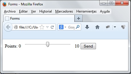
Range Type
This type makes the browser build a new kind of control that didn't exist before. As its name indicates, this new control lets users pick a value from a range of numbers. Usually it is rendered with a slider or arrows to move the value up and down, but there is no standard design so far.
The range type uses the attributes min and max to set the limits of the range. As well, it can have the attribute step to declare the set value by which it should be increased or decreased in each step.
Example:
<!DOCTYPE html>
<html lang="en">
<head>
<title>Forms</title>
</head>
<body>
<section id="form">
<form name="myform" id="myform" method="get">
Points: 0 <input type="range" name="mynumbers" id="mynumbers" min="0" max="10" step="5"> 10
<input type="submit" value="Send">
</form>
</section>
</body>
</html>
This is the result:
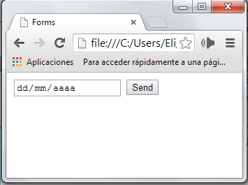
Date Type
This is another type that will generate a new kind of control. In this case, it was included to provide a better way for date entry. Browsers are implementing this feature with a calendar that shows up every time the user clicks on the field.
The calendar lets users select a day that will be inserted in the input field along with the rest of the date.
An example of usage is when a user tries to pick a date for a flight or a ticket; in this case, with the date type, the browser will build the calendar for us and we just have to insert the <input> element in the document to make it available for our users.
The interface is not declared in the specification. Every browser is providing its own interface and sometimes adapting the design according to the device in which the application is being run.
Usually, the value generated and expected has the syntax year-month-day.
Example:
<!DOCTYPE html>
<html lang="en">
<head>
<title>Forms</title>
</head>
<body>
<section id="form">
<form name="myform" id="myform" method="get">
<input type="date" name="mydate" id="mydate">
<input type="submit" value="Send">
</form>
</section>
</body>
</html>
This is the result in Chrome;
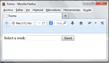
Week Type
This type provides a similar interface to date, but only for picking entire weeks. Usually the value expected has the syntax 2014-W10, where 2014 is the year and 10 is the number of the week.
Example:
<!DOCTYPE html>
<html lang="en">
<head>
<title>Forms</title>
</head>
<body>
<section id="form">
<form name="myform" id="myform" method="get">
Select a week: <input type="week" name="myweek" id="myweek">
<input type="submit" value="Send">
</form>
</section>
</body>
</html>
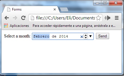
Month Type
Similar to the previous type, this one is for an entire month. Usually, the value expected has the syntax year-month.
Example:
<!DOCTYPE html>
<html lang="en">
<head>
<title>Forms</title>
</head>
<body>
<section id="form">
<form name="myform" id="myform" method="get">
Select a month:
<input type="month" name="mymonth" id="mymonth">
<input type="submit" value="Send">
</form>
</section>
</body>
</html>
This is how it looks in Chrome:
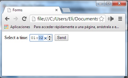
Time Type
The time type is similar to date, but only for the time. It takes the format of hours and minutes, but its behavior also depends on each browser at this moment. Usually, the value expected has the syntax hour:minutes:seconds, but also can be just hour:minutes.
Example:
<!DOCTYPE html>
<html lang="en">
<head>
<title>Forms</title>
</head>
<body>
<section id="form">
<form name="myform" id="myform" method="get">
Select a time:
<input type="time" name="mytime" id="mytime">
<input type="submit" value="Send">
</form>
</section>
</body>
</html>
This is how it looks in Chrome:
Datetime Type
The datetime type is for full date and time input, including a time zone.
<input type="datetime" name="mydatetime" id="mydatetime">
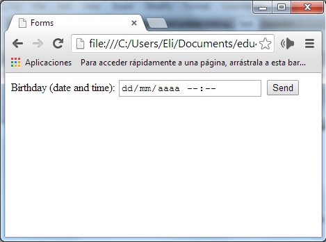
Datetime-local Type
The datetime-local type is just a datetime type without a time zone.
Example:
<!DOCTYPE html>
<html lang="en">
<head>
<title>Forms</title>
</head>
<body>
<section id="form">
<form name="myform" id="myform" method="get">
Birthday (date and time):
<input type="datetime-local" name="mylocaldatetime" id="mylocaldatetime">
<input type="submit" value="Send">
</form>
</section>
</body>
</html>
This is how it looks in Chrome:
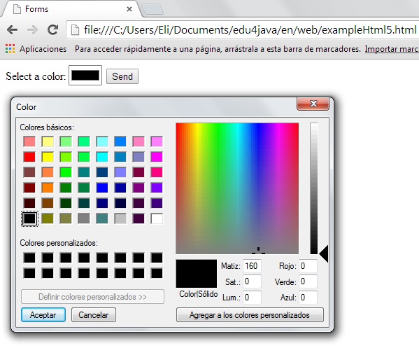
Color Type
In addition to types for dates and times, there is also a type that provides a predefined interface so that users can pick a color. Usually, the value expected for this field is a hexadecimal number, such as #00FF00.
Example:
<!DOCTYPE html>
<html lang="en">
<head>
<title>Forms</title>
</head>
<body>
<section id="form">
<form name="myform" id="myform" method="get">
Select a color:
<input type="color" name="mycolor" id="mycolor">
<input type="submit" value="Send">
</form>
</section>
</body>
</html>
There is no standard interface specified by HTML5 for color, but it is possible that a regular grid with a set of basic colors will be adopted by browsers.
This is how it looks in Chrome: